Tribeca | Art Group
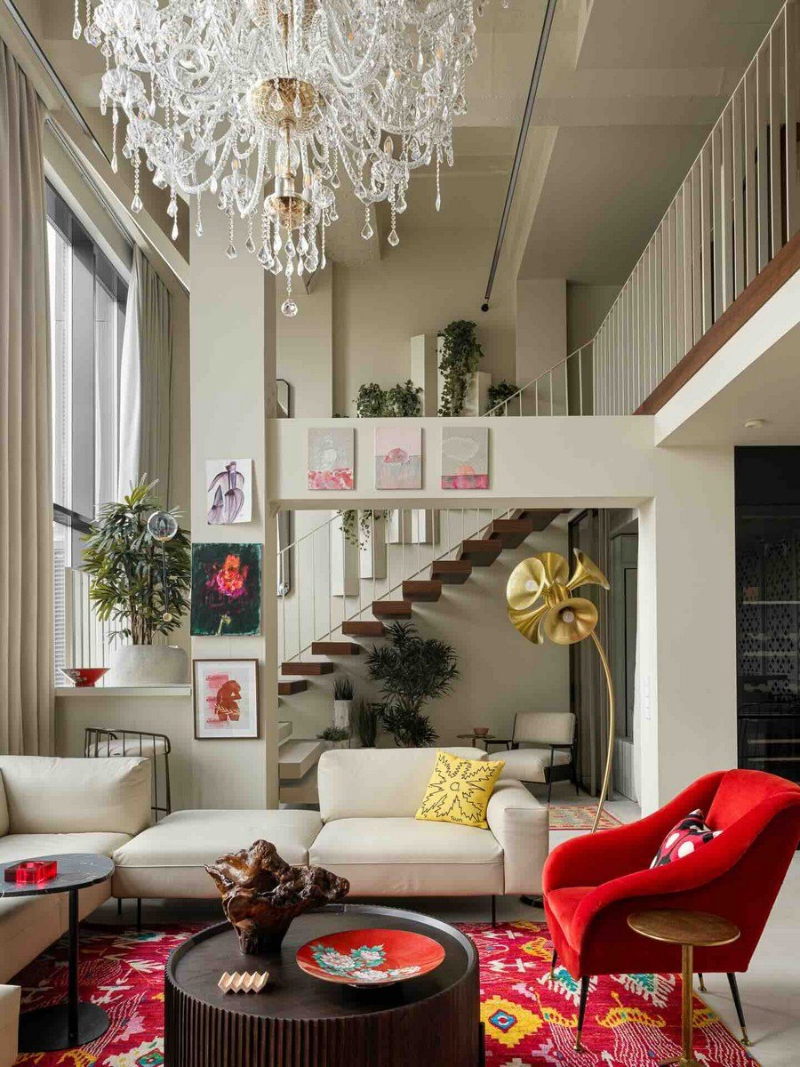
The Tribeca complex is the result of the reconstruction of the former Kalmykov Calculating and analytical Machinery plant. We got an industrial loft, which conveniently integrates a console floor and a living room with a two-level light.
There are three bedrooms on the console floor: a master bedroom and two children's bedrooms. One of the planning solutions that I actively use is buffer zones between bedrooms and bathrooms. Most often, this is an excellent option for integrating dressing rooms, storage areas (console floor) or laundry rooms (ground floor).
The ground floor consists of a kitchen and living room area with a second light, a guest room and a guest bathroom, which is accessed through a laundry room.
Design and USP Features
Light, but not bright. Functional and conceptual.
The Art Group's design language is bright interiors, we love color and eclecticism. At the same time, we do not strive to create a “picture”, it is important to us that people feel comfortable in the spaces we have implemented. Therefore, first of all, we are working on the architectural framework and layouts, and we create brightness through concepts and decor.
In this interior, we maintain the light color of the surfaces, balance it with the dark wood of the panels in the living room and hall, as well as the steps to the console floor. We choose a spectacular black for the laundry room, which looks contrasting with the white guest bag.
Bright accents are created thanks to the colored faucets in the bathrooms, and ceramic tiles, which we use both in traditional techniques: bathrooms, and not in standard ones: lining the area around the TV and closet doors in the hall.
As for the concepts, first of all, it is a family collection of tiles, which is described above. Another “custom” detail of the interior, from the point of view of branding, is the white grilles in the design of the kitchen wall panels are cut according to the template of the hostess brand logo - Bogda Nova.
Secondly, it was important for us to demonstrate the Russian accent of the design both conceptually and visually. One of the indisputable symbols of the interior of the Soviet era is the carpet, which was hung on the wall both for sound insulation and for decoration. We “hung” our carpet from ceramic tiles, which lined the facades of the cabinet in the hall, making it a place of attraction for this zone. I like it when the lobby can be played like an art gallery - a clean space and a bright accent. Having decorated the facades with Carpet tiles, we turned a simple cabinet into a king cabinet.
As for furniture and decor, in this aspect we follow our principle of eclecticism - we mix furniture from different eras and modern European brands.